Take Back Control Of Your Data
By Thomas Gauvin, Jacob Guirguis, François LaBerge
As tech moves forward, we will be generating more and more data online. As it currently is, tech giants are collecting oceans of data about their user and using personal user’s data to increase their revenues. Trying to counteract the efforts of these giants to fish users’ data will always lead to failure. However, users must be granted control of their own data. Therefore, we want to allow users to willingly sell their data by creating an online marketplace for data.
The Research
Designing an application to be used by the wide public is one of the hardest tasks a UX designer will encounter during their career. Especially when the application touches a very sensitive subject such as private user data. To ensure that our personas would accurately represent the feelings of the public, we opted for methods that would reach as many people, as closely as possible. Therefore, we chose to send surveys and run interviews.
Surveys
The survey we created was administered through a google form and distributed to our user population using popular social medias and messaging platforms, as a means to collect data from the masses. Since surveys are easy to distribute and quicker to complete than in-person interviews, a large set of data could be gathered rapidly and would provide direct responses to our design and implementation questions. After analyzing the data from the surveys, we noticed the following factors.
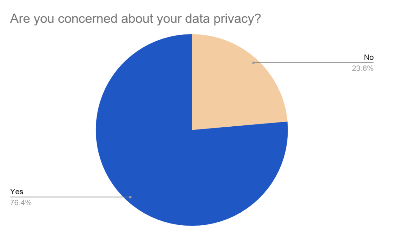
- The vast majority of the user population worried about data privacy. Thus, the security of users’ data and their feeling of control over it was a main focus for our design moving on.
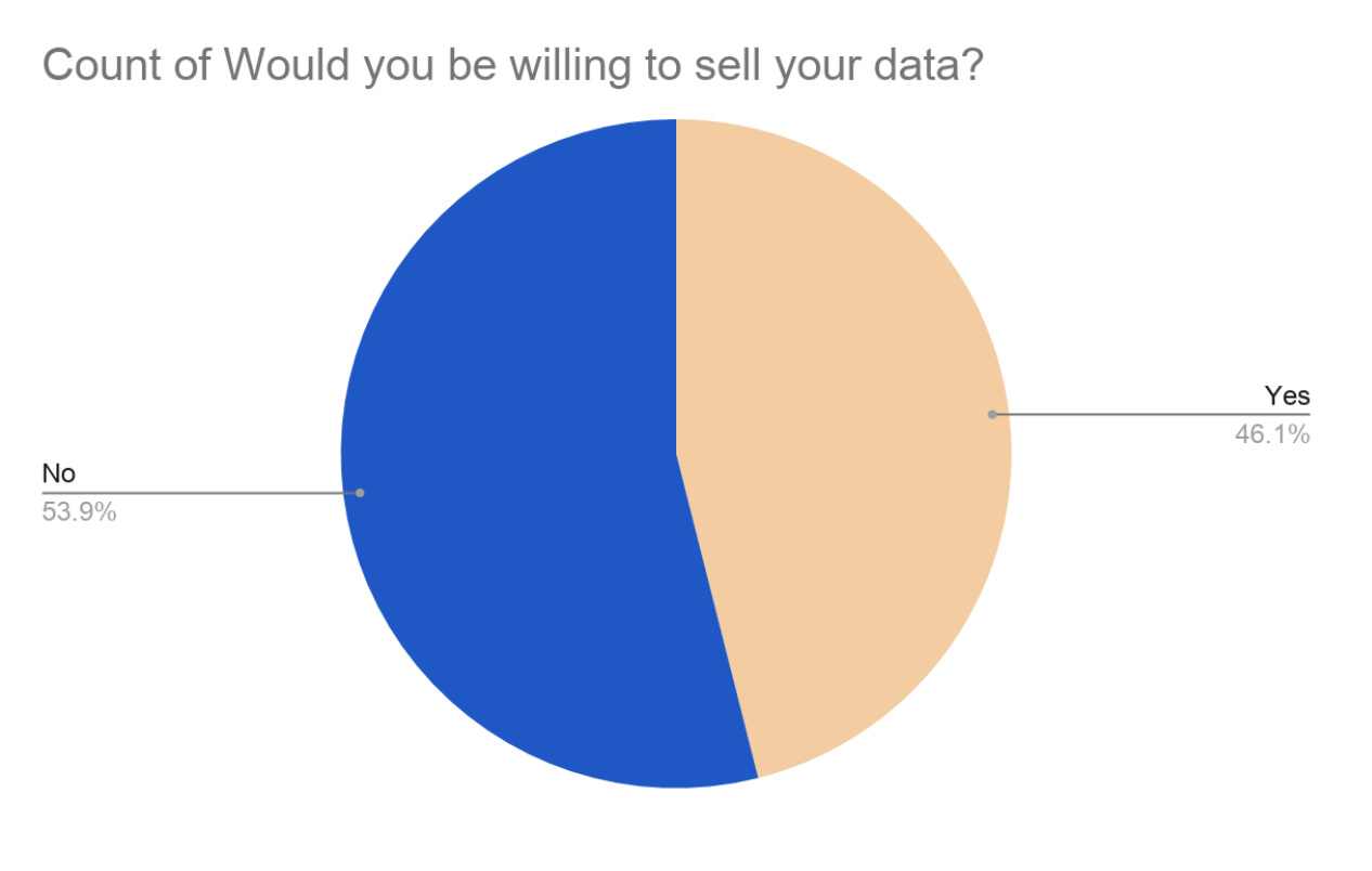
- Furthermore, we also realized that, while 53.9% of the surveyed population would not agree to sell their data, 46.1% said they would sell their data under certain conditions.
- The most prevalent reason to not sell their data was the risk of data leaks. To counter this, we considered this in our design of the application and implemented features to reassure the concerned individuals.
- Many individuals also expressed the unease of “selling data” to companies. When asked why they would not want to sell their data, one of our respondents answered: "Dignity".
Interviews
We opted to run two types of interviews : long in-depth interviews and shallow interviews in a vox pop form. The long and in-depth interviews were used to extract precise information and meaningful concerns from individuals on the potentials and pitfalls of a data marketplace platform. We recognized that many people with varying traits and backgrounds will voice distinct and personal opinions on the success of this platform which is invaluable to developers.
Personas
After scrutinizing our data, we were able to generate four user archetypes who would accurately represent our
surveyed population and be interested in using our application. These personas vary in age, gender, ethnicity,
career, and personalities, providing us with a wide range of traits which need to be pleased if they were to use
our platform.
Jessica Kwan
Jessica is very in touch with her online personal data and is aware that it is already being collected by large corporations. This being said, she would gladly offer companies her data in exchange for money as a way to lend her hand through her young adulthood. She is mildly concerned that her identity is a risk and doesn’t worry that her collected data could be used against her.
She is “The Opportunist”.

Pierre Jean
Pierre is against making a profit by selling his data. Instead, he would love to donate it to researchers in order to benefit society. He is against all large corporations turning a profit of the backs of their innocent consumers and would be hypocritical if he sold them his data. As an academic, Pierre loves research and lending himself to studies in the hopes of aiding in a new discovery or breakthrough. Thus, in his eye, his data is most valuable to fellow academics who grapple to collect enough meaningful data to conduct their studies.
He is “The Benefactor”.

Andrew Johnson
Andrew would consider selling his data but is uneasy with the idea that his personal information would be floating around. Andrew is a family man and loves spending time with his beloved. If he can be guaranteed that his data is safe and not used for malicious intent, he would sell it in in the hopes of receiving cash or travel discounts in order to go on a getaway with his family.
He is “The Concerned”.

Charles Mansfield
Mr. Mansfield is a high profile lawyer who has managed to rise through the ranks and become respectfully successful. This of course means that he has amassed large amounts of money throughout his career. Mr. Mansfield is not particularly concerned with data privacy but would not benefit from selling his data for cash since the little income from selling his data would be negligible in comparison to his finances. He, instead, is looking for tangible goods or services in exchange for his personal data.
He is “The Established”.

User Journeys
Making user journeys allowed us to flesh out the user experience of our product. This implies acquiring a
better understanding of the flow of events in which our personas participate in when using the data marketplace
platform.This UX design tool allowed us to identify our personas’ moments of discomfort, i.e. pain points, while
interacting with our platform.
Jessica was annoyed by the inability to sell her data to multiple offers at once. Therefore, this pain point was
addressed in further iterations of our design by adding a “sell to all button”.
Charles’ biggest gripe with the platform was the difficulty to find offers with rewards rather than cash. This
pain point was rectified by allowing users to specify the types of rewards they wished to receive upon signing
up for the application. Moreover, a search bar on the “My Offers” page. These UI/UX elements also solved
Pierre’s pain point of being unable to find research-type offers.
Pierre’s irritated by the fact that he couldn’t filter out the data requests submitted by large corporations.
This pain point was also solved by allowing users to provide a list of “blacklisted” companies as well as a
“block this company” button within detailed offers’ pages should unwanted companies slip his mind.
Andrew was most displeased with the uncertainty of the safety and security of his data when selling it through
the application. This pain point was resolved by inserting a disclaimer section on every offer card explaining
in detail how the company is to take care and ensure the security of the users’ information. Each company must
adhere to those safety standards before advertising any offers.


Application Concept
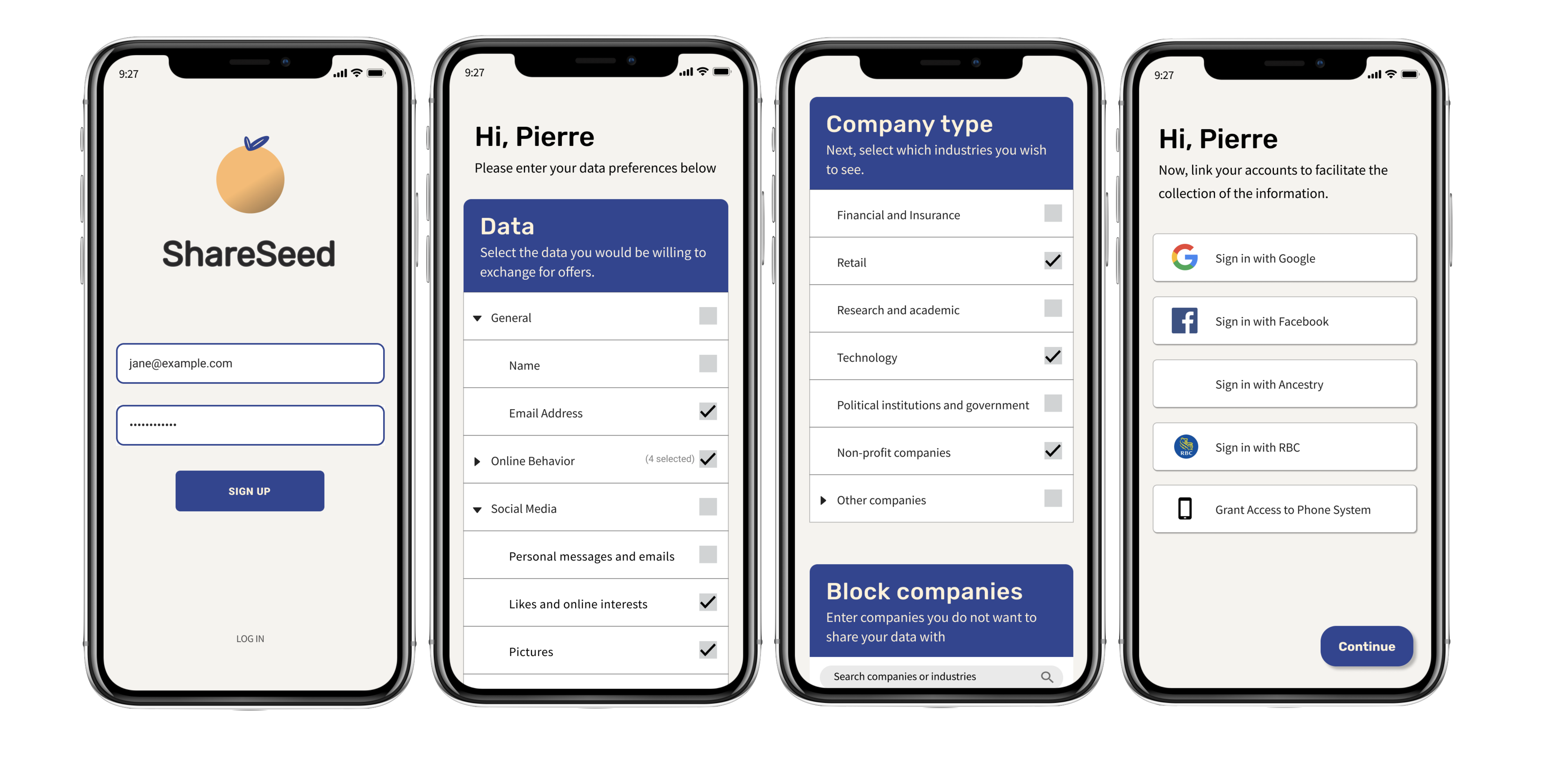
We decided to call the application ShareSeed. We decided on this name because we wanted to explain the
application while easing the concerns of the users. The word “Share” indicates the action of sharing the data
with other entities. We decided to use the word “Share” because through our user research, we noticed that
people had an aversion to the idea of “selling data”, for concerns of dignity and “selling out oneself”.
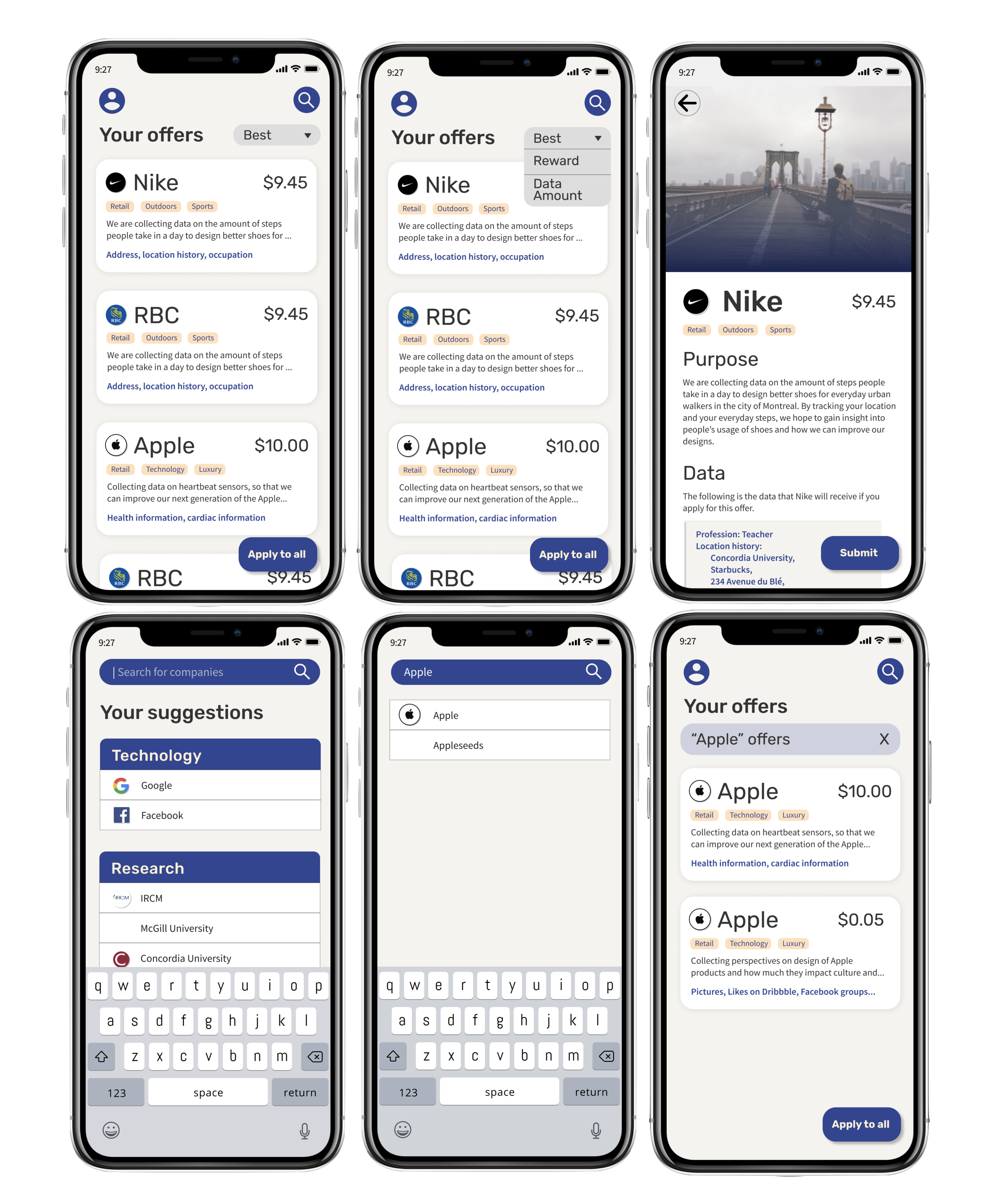
In our application, every company would submit a request for data, stating the purpose, the compensation and the
data requested. These requests would then be sent to the user, based on the data they entered and their other
preferences. These requests were displayed to a user individually through a list, and we called the requests
“Offers”. This frames the request for data as a voluntary action that the user can opt in to be compensated for
their sharing of their data. The reason for displaying these offers individually is because we noticed that
every user had a different preference regarding the data shares, and every user wanted to review the terms of
the sharing of the data. Therefore, each offer is able to be inspected in the Offer Page.
An important aspect of the Offer Page is the full transparency section. In this section, we display the full
data that the user is sending to the company as part of the data sharing. This appeases the concerns of the
user. The Offer Page also states the full purpose for the data share.
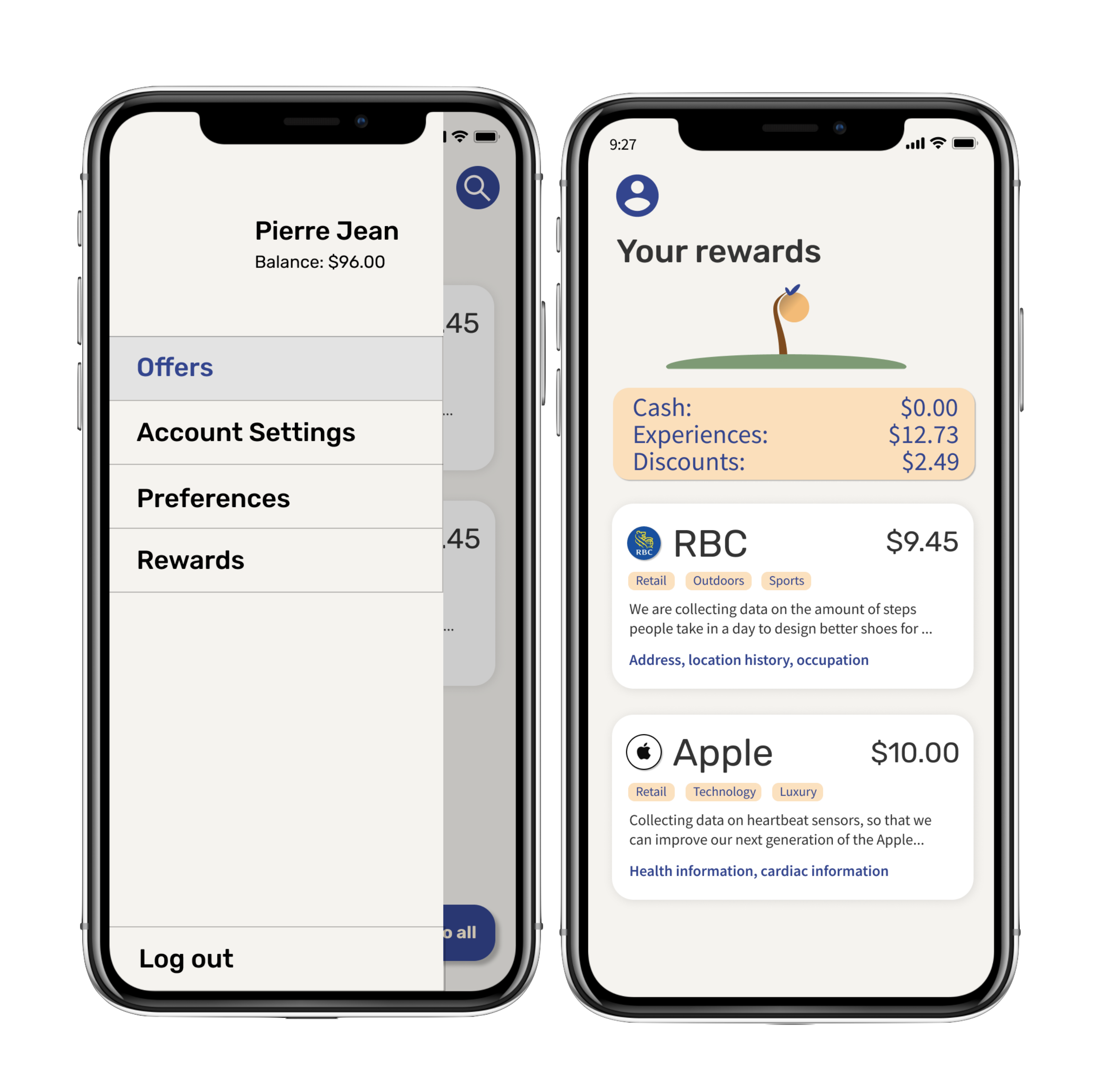
The Rewards section in the setting pane allows users of the application to keep a tab on all previous
transactions. Upon entering the rewards view, the user will be greeted with an orange tree which will
dynamically grow based on how many transactions they have made. Below the tree will the user’s previous
transactions sorted in reverse chronological order.
Sketches
In order to roughly visualize the final product, we created high-level sketches to give us more insight and feeling for the app design. At this stage in the design, we started making strong decisions about the layout of our application. For instance, we established that the offers would take the form of a list of cards. Moreover, we established the several main views that our users would be interacting with. Although these were preliminary, there were the foundation of the design as a whole.

A Few Design Decisions
During the sketch phase, we established that the offers would take the form of a list of cards. This would ensure that the offers are displayed as users would expect. This display format also makes the offers easy to browse, search and filter. We also decided that navigation within the application would take place through a “Hamburger” menu to the left side of the application. We decided to opt for this type of menu as it is prevalent in North American and European markets, where data privacy is a concern. This menu is accessible from any page referenced by the menu.
Wireframes & User Flow
The wireframe is a skeleton of the application which allowed us to further concretize the layout and flow of operation of our application. At this stage, UI and styling was still not our main focus but rather the user’s interaction with the platform. We took the previously made sketches and created the different views containing very basic shapes. Once that was completed, we linked the views together in order to map out the typical interactions our personas encounter while searching for offers.

Color Palette
Before attempting to create our first mockups, we spent a significant amount of time debating the best choice of color to use for this type of application. Since personal data is a sensitive topic, we opted to choose few colors and soft colors in order to ease the user in and provide them with a sense of comfort while navigating the platform. The application’s colors are dark blue, peach, and black as seen above.

Typography
imilarly to the color palette, we decided to avoid harsh lettering in order to appease the user and make them
feel comfortable. We chose 2 fonts to use within our application.
The “Rubik” font was chosen for the text seen on the display. It is a modern yet approachable font.
The “Source sans” was chosen for the main text seen throughout the application in order to provide extra
sophistication over the “Rubik” font, while still remaining easy to read. The Rubik font is displayed on
the left, the Source Sans font is displayed on the right.


Mockups
With the color palette and fonts styles finalized, we were finally able to move on to creating the mockups. The general feeling that we tried to evoke through the design was that of trust, collaboration, and welcoming. Therefore, we decided to design the application according to standard design guidelines, emulating the applications that use few colors such as Instagram, Facebook, Apple, etc. that our users would typically use. We decided to use our chosen colors to indicate actions, as the blue is a clear contrast and draws the attention of the user. For the general feel of the application we opted for rounded corners to remain consistent current applications available on the Appstore.
A Few Design Details
There are certain details that we are unable to communicate through the mockups themselves. In terms of interaction, the list of offer cards are swipeable, such that the user can decide to swipe away an offer card, which the user will never see again. Moreover, the hamburger menu is a slide out panel, which makes it clear that the panel is present to the left side of the application and is reachable at any time.
Prototype
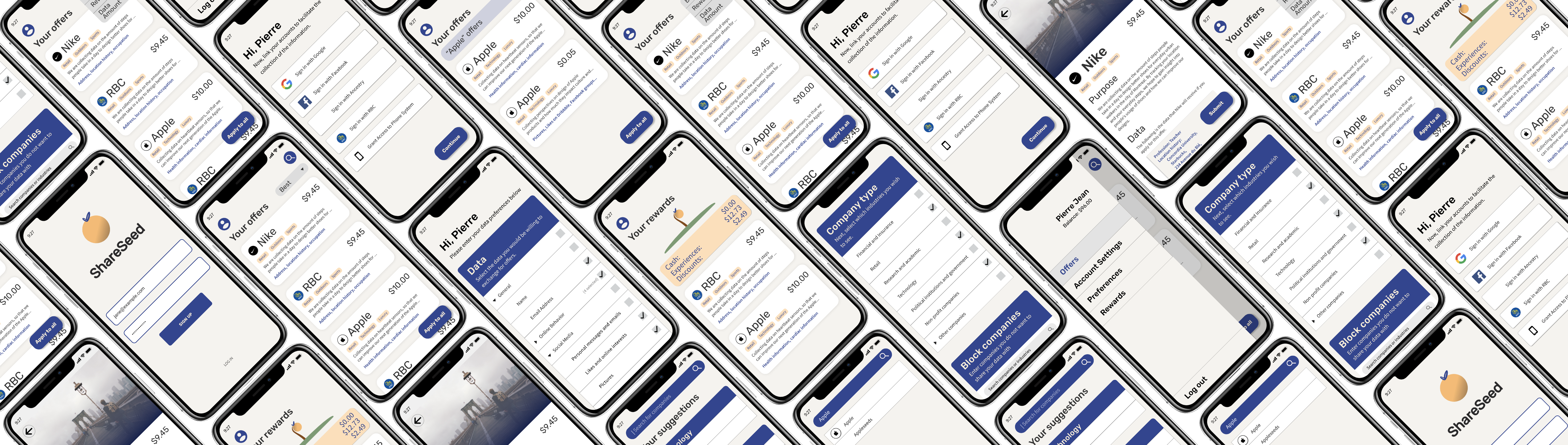
Prototyping was the last step of our interaction design process. In this stage we can experience the full UI and UX design of our application. The typical user flow can be experienced with the prototype and goes as follows. For instance, from the offers page, the current prototype shows the expected behavior with the Nike offer. It also shows the search functionality, where a user might want to type in ‘Apple’ and select the Apple company offers. The prototype also shows the signup process, and the menu tab which allows for a consistent app navigation. Lastly, the prototype also shows the initial “profiling” process of the users, from establishing the user’s preferences to connecting their design platforms.
Two functionalities are not included in the prototype. The first is the ability to click on the RBC and Apple cards from the “My Offers” page, currently only the Nike card is functional. The second is the “account settings" menu item from the hamburger menu is not currently clickable, the real button would open a browser to lead to an accounts settings page on ShareSeed’s portal.
Final Thoughts
This UX project offered an interesting perspective into the different points of view regarding data privacy and the potential for selling data. In terms of research, we were intrigued by the diverging opinions regarding the sale of user data, and we explored the reasons why. This allowed us to design an application that considered these perspectives, which was definitely more difficult than expected. It was fun to come up with an application that framed the opportunity of matching a buyer of data with a seller of data in such a way to protect the dignity of users. By framing the requests of data as offers for compensation in return for data, we flipped the topic on its head and appeased the concerns of the users. All in all, there were many details that we had to not overlook, and it was a great learning experience.